Key Takeaways
Packaging designs often fail because they are created in isolation, prioritize style over clarity, or mimic competitors too closely. Overloaded front panels confuse shoppers instead of engaging them, and designs that are never tested risk costly missteps. Avoiding these mistakes and testing in real contexts helps packaging stand out both on shelves and online.
Designing packaging is no small task. You need to strike the right balance between creativity and clarity, branding and differentiation, beauty and performance. It’s easy to fall in love with a design that looks amazing on a screen, only to find out later it doesn’t perform in store.
This happens more often than you’d think. A design may check every box in a presentation, win praise from the team, and feel totally on-brand, yet once it hits the shelf, it doesn’t deliver. It gets overlooked. Not because it was bad, but because it didn’t stand out where it mattered most: in the real world.
The good news is, most of these missteps are common, and fixable. After testing thousands of packaging visuals at Brandpulse, we’ve seen clear patterns. Here are the top five mistakes we see brands and designers make, and how you can avoid them.
1. Designing in Isolation
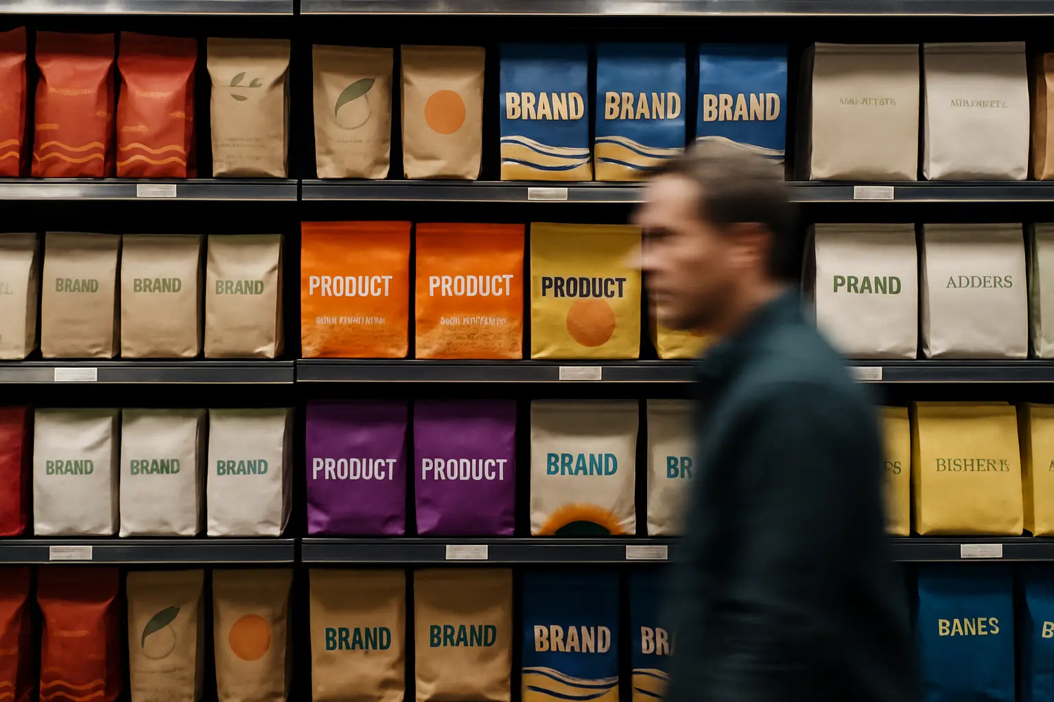
It’s one of the most common traps, reviewing packaging on a beautiful white background, centered on a presentation slide, free of all context.
The problem? That’s not how your audience sees it.
In reality, your packaging is surrounded by competitors. On a shelf. On a screen. In a feed. And in that environment, the design you loved in a vacuum may just disappear.
What looks great in a presentation might completely disappear in-store. That’s why context matters. Always review packaging designs in real-world environments. Shelf mockups, retail simulations, and mobile previews can help. Better yet, use a tool like Brandpulse to run Shelf Impact Testing and get real data on which version gets noticed faster.

Definition
Shelf Impact Testing is the process of evaluating how well a packaging design stands out in a realistic retail or digital context. Instead of reviewing designs in isolation, they are placed among competitors to measure visibility and attention. This helps brands understand whether their packaging has stopping power before committing to production.
2. Prioritizing Style Over Clarity
A slick, minimalist look might win over your internal team, but if it hides your product or confuses shoppers, it’s not working.
We often see beautiful designs where the brand name is hard to read, the product type is unclear, or the main message gets lost in the layout. When shoppers only give you a second or two of attention, clarity beats cleverness.
Shoppers aren’t studying your packaging. They’re scanning. You have a second or two to communicate what it is, who it’s for, and why it matters. If that’s not obvious, you’re in trouble. Make sure your design has a strong visual hierarchy, with one clear focal point and intuitive flow. Don’t assume people will take the time to figure it out. They won’t.
3. Looking Too Much Like the Category
It’s tempting to follow what’s already out there. After all, if everyone else in the category is using muted tones and serif fonts, that must be what works… right?
Not necessarily.
While it’s important to look relevant to your category, blending in means getting skipped. If your packaging doesn’t disrupt the visual pattern on the shelf, it won’t get noticed. No matter how beautiful it is.
Do a quick scan of your shelf competitors. What colors, shapes, and styles dominate? Now ask, how can we respectfully disrupt this space? Maybe it’s through color, layout, typography, or even humor.
Remember, attention is a precondition to everything else. Be brave.
4. Overloading the Front Panel
You’ve got a story to tell. A unique brand. A product with features, certifications, benefits, and emotional layers.
But if you try to cram all of that into the front of your packaging, shoppers won’t read it, they’ll just tune out.
Too much information leads to visual overwhelm. The brain doesn’t know where to look, and as a result, looks away.
Keep your front panel focused. Aim for one key message, supported by a clean visual hierarchy. Save the extra information for the side or back. Give the design room to breathe and shoppers a reason to stop and engage.

Fast Fact
Research shows 76% of purchase decisions are made in-store, often within just a few seconds. Packaging that fails to grab attention in that moment risks being overlooked.
5. Not Testing Before Launch
You’ve narrowed it down to two or three designs. You’ve debated internally. Everyone has their favorite. So, you pick one and hope for the best.
But what if you’re wrong?
We’ve seen this happen countless times, teams go with the “safe” or “liked” version, only to learn later that it’s not the one shoppers respond to. And by then, it’s too late.
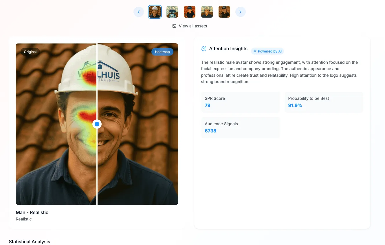
Pre-test your packaging before you print. Tools like Brandpulse let you upload your design concepts, test them with real people, and receive a Stopping Power Rating (SPR), a data-backed score that shows which version grabs attention the fastest.
It’s fast, easy, and it gives you real clarity before production costs kick in.
Bonus Mistake, Ignoring the Digital Shelf
Packaging used to live mostly in stores. Now, it lives everywhere: on your website, on Amazon, in social media ads, and in influencers' unboxings.
A design that looks great on a shelf might not pop in a 200x200 pixel square online. If your packaging doesn’t work in digital spaces, you’re missing a huge piece of the puzzle.
Mock up your packaging in digital contexts. Shrink it down. Scroll past it on a mobile screen. Does it still grab attention? If not, you may need a digital-specific variation or to rethink the hierarchy for those platforms.
Wrapping It Up
Great packaging is a blend of strategy, creativity, and performance. It’s not just about what looks good, it’s about what gets seen.
By avoiding these common design mistakes and testing your concepts before they go live, you’ll dramatically increase your chances of standing out, grabbing attention, and driving real results.
Because in a world full of distractions, the best packaging doesn’t whisper. It gets seen.
Want to test your packaging and find out which version has the highest Stopping Power? Start your Brandpulse test today and get real audience insights before you go to print.

Great packaging doesn’t just look good in a deck, it earns attention where it matters most: on the (digital) shelf.
Ready to Optimize Your Content?
Join thousands of brands using BrandPulse to create high-performing content through the perfect blend of AI and human insights.
Let real human feedback choose the winning content for you
Start A Test


About the Author
Arno Kooijman
Arno is the founder of Brandpulse, where he’s on a mission to help creative teams make smarter decisions with real human insight. With a background in marketing and a sharp eye for what makes brands stand out, he created Brandpulse to close the gap between great ideas and actual audience attention. Arno believes that when creatives see how people really respond, they unlock their most impactful work.