Key Takeaways
Packaging design success is not only about aesthetics. Shoppers make decisions in just a few seconds, often guided by quick visual cues such as contrast, shape, and clarity. Designs shown in isolation during presentations can fail once placed in crowded, real-world contexts. Stopping Power explains why some packaging captures attention while others are overlooked. Testing reveals which design elements consistently help products stand out and perform better at the point of sale.
You’ve done everything right.
The packaging looks stunning. The colors are balanced, the typography is sharp, and the design is aligned perfectly with the brand. Everyone on the team agrees, it’s one of your best projects yet.
But then it hits the shelves...
And nothing happens.
Sales are underwhelming. The client starts asking questions. You start questioning yourself. How can something that looks this good fail to perform?
It’s a frustrating moment and a surprisingly common one.
The truth is, great design isn’t always enough. In fact, some of the most polished packaging designs out there quietly disappear on the shelf; unnoticed, unchosen, unpurchased. Not because they’re bad, but because they don’t grab attention.
Let’s talk about why that happens, and more importantly, how to fix it.
The Harsh Reality: People Don't Shop Like Designers Think
When you’re deep into a packaging project, you’re looking at the design up close. You’re zoomed in, carefully adjusting kerning, comparing shades of green, obsessing over visual harmony.
But your shopper? They’re in a rush. They’re tired. They’re glancing over a wall of products without even realizing it. You’ve got less than three seconds to make an impression and in that moment, they don’t see your details. They just see shapes, colors, and contrast.
In that instant, the brain decides whether to look closer or move on...That’s Stopping Power.
If your packaging doesn’t stop them, nothing else matters.
- Not your logo.
- Not your story.
- Not even your product.
So Why Do Great Designs Fail?
Because most packaging is designed to look good, not to get seen.
In agency presentations and internal reviews, designs are shown in isolation centered on a clean white background, perfectly lit, full screen. But that's not how people encounter your product.
In the real world, your packaging is crammed on a shelf next to dozens of competitors. Or it’s squeezed into a thumbnail on Amazon, surrounded by ads and distractions.
What worked in the pitch deck doesn’t always translate in the wild.
And when that happens? Even the most well-crafted packaging can underperform.
The Solution: Design for Attention First
If people don’t see your packaging, they can’t choose your product.
That’s why attention isn’t a nice-to-have. It’s the starting point.
You have to design with one primary question in mind:
“Will this stand out in context?”
Not in a mockup. Not on a moodboard. But In the real world.
Designing for attention means making bold choices. It means understanding how humans actually see and respond to visuals, and sometimes, it means letting go of what’s trendy or safe.
It doesn’t mean sacrificing beauty or brand integrity. It just means making sure your design gets its moment to shine.
Introducing the Stopping Power Rating (SPR)
At Brandpulse, we work with brands and agencies to help them understand exactly which designs capture the most attention, and why.
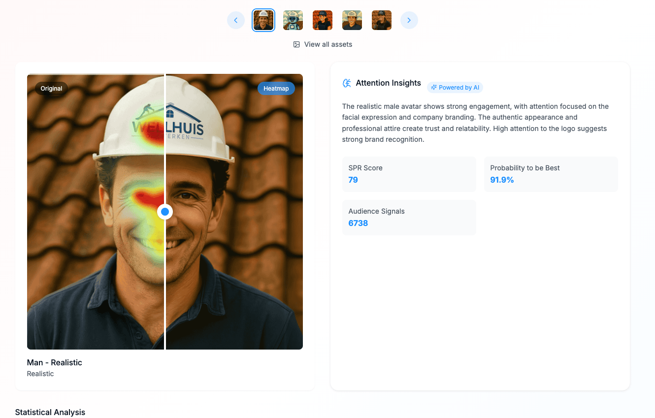
We do this by measuring Stopping Power using real audience responses. Each packaging concept is tested with actual people in realistic settings, and each one gets a Stopping Power Rating (SPR): a simple score that shows how well it draws the eye.
Think of it as a new creative superpower: You don’t have to guess anymore. You don’t have to rely on opinions or internal preferences. You can see which version actually performs before you print a single unit.

Definition
Stopping Power is the ability of a design to capture someone’s attention in a crowded environment. In retail, you have less than three seconds to make an impression. If your packaging makes a shopper pause and take notice, it has stopping power. Without that first moment of attention, your story, logo, and product remain invisible.
What Makes Packaging Grab Attention?
From running thousands of visual tests, we’ve noticed certain elements consistently help packaging stand out:
- Bold contrast: High color contrast helps a product jump off the shelf. When everything around you is muted, a splash of brightness breaks the pattern.
- Clear visual hierarchy: Shoppers need to understand what they’re looking at fast. Make sure your brand, product, and key benefits are clearly prioritized.
- Distinct shapes or layouts: Anything that disrupts the typical category look helps. Maybe it’s a vertical label in a horizontal world, or a layout that bends the grid.
- Emotionally engaging visuals: Faces, humor, strong claims, visual metaphors these all spark curiosity and draw attention.
- Simplicity with impact: The brain loves clarity. A single strong idea almost always beats a cluttered, “cover all bases” design.
But here’s the twist: sometimes what you think will work… doesn’t.
And that’s why testing is critical.

Fast Fact
Shoppers typically spend less than two seconds visually engaging with a product on the shelf (about 1.9 seconds on average)
Real Example: A Tale of Two Designs
We recently worked with a consumer brand launching a new line of wellness drinks. They had two packaging designs ready to go. One was minimal, clean, soft-toned very on-trend. The other was punchier, with bold typography and a splash of unexpected color.
Internally, most people leaned toward the minimal version. It felt premium, elegant, and “safe.”
But when we ran both through Brandpulse, the punchier design had 42% more stopping power.
It wasn’t a little better. It was a lot better. And guess what? On shelves, it outsold the other concept by over 30%. This isn’t a one-off story. We see this time and time again:
- The bold design wins.
- The unexpected layout draws the eye.
- The clear message cuts through the noise.
And none of that would have been obvious without testing.
The Fix: Test Before You Commit
You wouldn’t launch a product without validating the market. So why launch packaging without validating the design?
With tools like Brandpulse, you can test multiple packaging variations and see which one grabs attention best based on real data from real people. Each concept gets an SPR score, so you can confidently choose the version with the most visual impact.
This kind of creative testing is fast, affordable, and way more effective than relying on guesswork or internal feedback loops.
It’s not just smart, it’s essential.
Final Thoughts
If you’ve ever launched a packaging design that didn’t perform like you hoped, you’re not alone. But now, you know why. And you know how to fix it. Next time, start with attention. Test your concepts. Use the data. Then design something that doesn’t just look great but works.
Because the best packaging doesn’t whisper. It gets seen.

Great packaging doesn’t live in a PDF. It lives in the real world, and in the real world, attention is everything.


